The mark
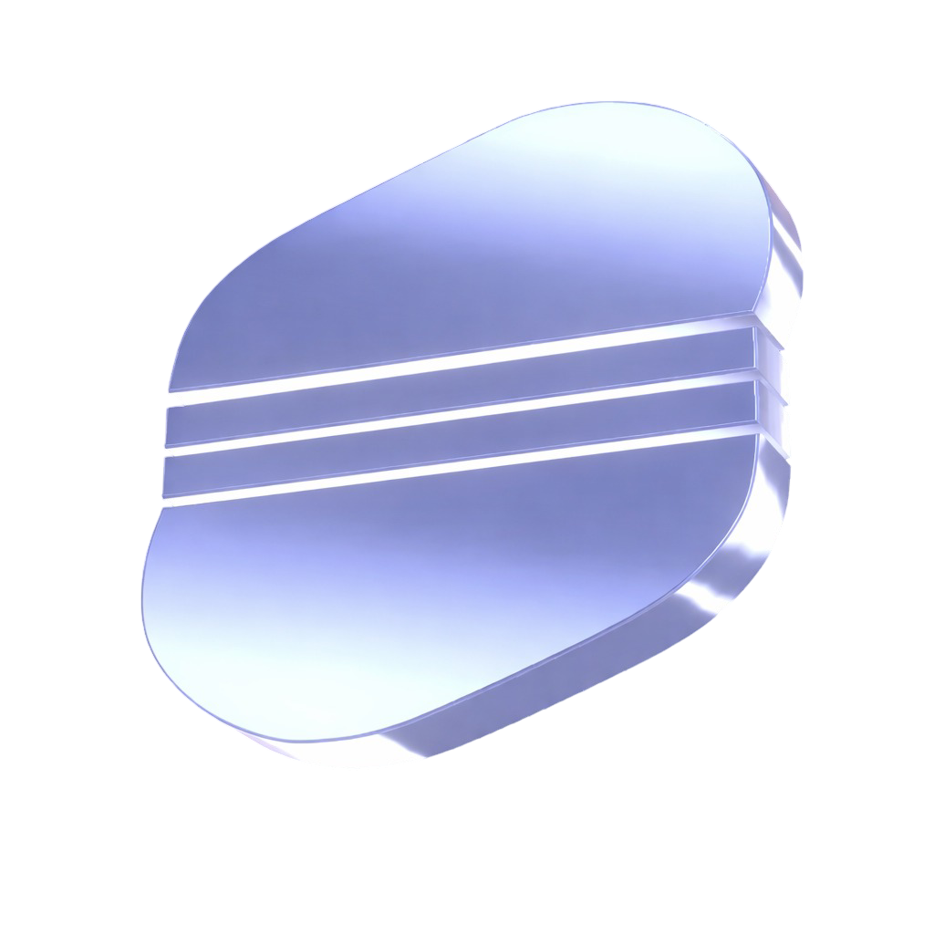
The OperSa mark is the vaulted asset, a rounded ingot with three lines. Use it on its own when space is tight, as an app icon, or as a profile picture.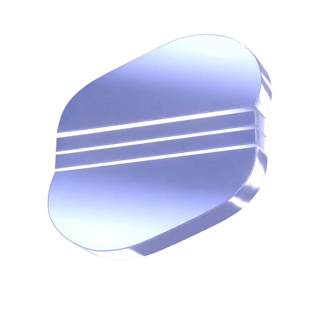
The wordmark
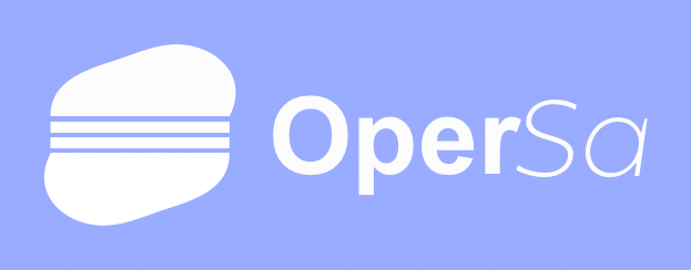
The primary lockup: the mark plus the OperSa logotype. This is the default. Use it wherever there is room. Download the wordmark (PNG)
The logotype
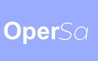
The OperSa name on its own. Note the construction: Oper is set bold, Sa is set in a lighter italic. Keep that contrast. Never retype the name in another font. Download the logotype (PNG)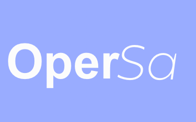
Please do not
Recolor the marks
Do not change the logo colors, add gradients that are not ours, or place the periwinkle lockup on a clashing background.
Distort or crowd
Do not stretch, rotate, or squeeze the marks, and do not crowd them. Give the logo clear space of at least the height of the mark on every side.
Rebuild the logotype
Do not retype OperSa in a different font or flatten the bold and italic contrast. Use the supplied files.
Add effects
Do not add drop shadows, outlines, or glows beyond the soft halo used in product. Keep it clean.
Typography
OperSa runs on three typefaces. All three are free and load from Google Fonts, so anyone can match the brand exactly.Familjen Grotesk
Display and headlines, and the OperSa logotype. Confident, geometric, a little editorial.
Manrope
Interface and body text, including everything you are reading here. Clean, neutral, highly legible.
Fraunces
Editorial serif accent, used in italic for eyebrows and financial subtitles. The touch of bougie.
Familjen Grotesk
Display and logotype.
Manrope
Interface and body.
Fraunces
Italic serif accent.